Tabbing through a web page can be a frustrating experience. The user tabs to access a menu, but with the keyboard's next tap, they’ve moved on to another page element and have to retrace their steps to access the desired content.
For users who rely on keyboard navigation, this can be a major accessibility roadblock. And for other site visitors, it’s just poor UX.
Fortunately, you can implement a fairly straightforward function in JavaScript called a “focus trap” to ensure users don’t leave the page area they’re in without intending to do so.

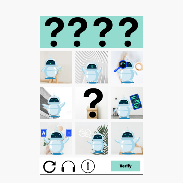
CAPTCHA is an essential need on online forms, but to be blunt, the UX sucks. Without the implementation tips (helpfully detailed below), Google’s otherwise reliable reCAPTCHA service implemented “as-is” doesn’t actually provide any browser validation. The user will have to wait for it to make a time-consuming round trip to the server. It’s a problem for anyone and becomes compounded for users with accessibility needs.
Links are among a website's most valuable components. They connect (that’s what the word “link” means, after all) different pages and resources, helping site visitors find the content they are looking for. Well-planned and formatted links are like a detailed, intuitive treasure map that sends visitors to the right destination.
Links are also critical for making your website accessible to visitors with visual or other impairments. A link that lacks important information can prevent some visitors from accessing all the treasures a website holds. Or even worse, it can send users to completely undesirable content and discourage them from exploring all your site has to offer.
In this post, I’ll discuss how to present links in various contexts, clearly explaining how they can create and inform powerful relationships between different pages and assets.

Deciding to develop your website to conform to the Web Content Accessibility Guidelines (WCAG, pronounced “wickag”) is a positive move that will allow more visitors to consume your content and will help meet impending legal requirements. But how do you get started? What steps do you need to take to make your site more accessible and ensure it stays accessible?
We here at Mugo have helped many teams navigate the website accessibility process. The following outline can help you navigate the process.

Want to pick up some pro strategies on how to make your website accessible to people with disabilities?
On Tuesday, July 11, our in-house accessibility expert will share his knowledge and technical tips on web accessibility.

We’ve been writing a lot about accessible websites lately because it’s a topic we’re passionate about at Mugo Web. We believe that whether or not web accessibility is governed by law in your region, making your site accessible to people with disabilities is good business practice. And there are literally millions of reasons to do so.

The reasons for bringing your website in line with the Web Content Accessibility Guidelines (WCAG) 2.0 are well documented. Whatever your rationale for embarking on this worthy task, you will need to assess your current online presence for compliance.
Auditing and developing accessible websites will require you to become familiar with what is referred to as a “screen reader”.

Making your website accessible to people with disabilities - whether you’re launching a brand new site, or remediating an existing one - may seem complex when you consider all the components that require attention (in-page navigation, links, colour contrast, forms, and alt tags, among other things). But the right CMS can make the job a lot easier.
A key component of an accessible website, accessible in-page navigation provides a way for website visitors to jump straight into the main content on your site and access different sections of the page quickly, without having to tab through every link to get there.

Ensuring your website is accessible to all members of your target audience can add unique requirements that demand novel solutions from your development team.

Links are the pathways that bind the web and give it structure. For people with web accessibility challenges, perceiving and understanding the links on your website is of utmost importance.