Mugo partner since 2019
A real-time workflow and data cleanup fuels successful site relaunch.
The CleanerSolutions laboratory needed a better system for updating and publishing its extensive public database of safety and effectiveness reviews of cleaning products.
The service, part of the Toxics Use Reduction Institute (TURI) at the University of Massachusetts Lowell, typically conducts dozens of new, highly detailed product reviews each month. Businesses, consumers and vendors rely on accessing this data to make purchasing decisions and apply for product certifications. But an outdated data input workflow and publishing process – which required information to be manually posted to multiple systems – resulted in the CleanerSolutions.org website being updated irregularly, only about once a quarter.
What’s worse, the extreme hassle of updating the old database resulted in some reviews simply never being processed, and a data structure that was prone to error and over-complication.
“Sometimes, due to delays and the cumbersome nature of processing reports, students would make mistakes or simply not get back around to uploading reports at all,” said Jason Marshall, the institute’s laboratory director. “We had gaps in the research data we were trying to present to the public, and getting that situation corrected was the main goal of this project.”
To find a better way, CleanerSolutions.org turned to its development partner Mugo Web, which has been working with TURI for about a decade and helped re-design and launch the institute’s main site in 2018.
The result, which launched early this year, is a dramatically improved site management system that allows for new reports to be published in near real-time. The lab’s database’s structure has been cleaned up, simplified, and moved into a single state system, the Ibexa DXP. Data quality is enforced throughout a user role-based workflow.
And as an added bonus, the CleanerSolutions.org site now has a clean, responsive design that’s inline with TURI’s overall visual brand.
Prior to the new site project, which kicked off in July 2020, the public-facing CleanerSolutions.org site published on a custom-built PHP framework that launched around 2008. However, the data that fueled the site lived in an entirely different database, creating what Marshall called an “extremely cumbersome,” largely manual publishing process.
The 25 or so students who work in the CleanerSolutions lab would conduct research and create their initial reports in standard productivity software. To get this information into a locally hosted Access database, students had to use a single system on the university’s network. And due to IT infrastructure issues, only one user could be logged into the Access database at a time.
Since the student researchers do about 30 reports a month, depending on economic conditions and client demand, Marshall said this created a bottleneck that seriously undermined the lab’s efforts.
When (and if) data found its way into the Access database, it then had to be manually extracted by an authorized user – most often Marshall himself – and uploaded to the live site via FTP in the form of multiple CSV files.
This required running SQL queries for both common searches run by consumers, as well as posting specific results and comparison reports at the request of the lab’s various clients. Program managers had to communicate directly with these clients about where to find these results on the site.
Cleaning product vendors often directly request a TURI performance test of their products that can be used for third-party green product certification efforts, such as Green Seal and EPA Safer Choice.
Manufacturers can use the info in the database – which dates back as 1993, when the lab began operations – to aid in identifying possible safer and more effective cleaning products to use at their businesses.
Alicia McCarthy, a lab specialist, explained that state government officials use the lab’s research to promote less hazardous products for industrial manufacturing as well as janitorial/custodial needs. Many groups use the tool to identify safer household and institutional cleaners.
That’s a lot of CSV files to pull and upload.
As with all database-centric projects, the core issue for the CleanerSolutions.org relaunch was understanding, simplifying and migrating the data structure as it existed in the old Access database into its new Ibexa DXP environment.
Paulo Valle, the lead developer on the project for Mugo Web, said the Access DB had about 40 tables in it, some of which were functionally dead. A few records had only a few attributes associated with them; others had as many as 40 or 50 attributes.
And the issues went beyond data structure to basic data quality. For example, the Access-based data entry process allowed users to step outside the prescribed data structure and input variant strings for some values. Valle said hundreds of items had to be cleaned up, in addition to being reorganized. One list had about 20,000 items.
Marshall noted that the site relaunch project did not necessitate adding a lot of new fields to the database, although there were some updates to health screening data.
Overall, the Access data structure was simplified down to about six content types in the new Ibexa DXP database.
With a solid data structure in place, the next step was to ensure that data was input correctly and in a timely fashion.
The former, highly restrictive Access workflow was replaced with web-based forms native in the Ibexa DXP. Mugo Web’s Valle said he added a few drop-downs and other validation devices to ensure data quality and consistency.
The new workflow is based on the Ibexa user permissions system. Student researchers input their draft reports directly into Ibexa; Marshall, McCarthy or other lab administrators are notified of the submissions and review them for accuracy; and then with a single click, the data is live on the public site. What once took months now takes minutes.
“The updates that we have completed with Mugo have drastically improved how we operate,” McCarthy said. “The streamlined efforts of using the tools back-end interface have allowed for a nearly real-time dissemination of testing results.”
And with the public site publishing from the same state database, changes and updates to search queries no longer need to be manually run and uploaded to the “live” environment. McCarthy noted that she can now simply give clients a URL with query-defining parameters that the client can check periodically for new updates, with no additional involvement by TURI staff.
The guiding design principal for the new CleanerSolutions.org was to show visitors how much data is available, but to simultaneously not overwhelm them with too many search options. By collaborating with our external design partner, Spin Key Media, we were able to achieve this.
“The data all works together to illustrate a comparison or feature set, so showing it out of context is not very useful to the user,” Mugo Web’s Valle said. “So the design has to provide that context and make it easy to find answers.”
Unlike many websites, the CleanerSolutions.org site home page does not feature an open-ended string text box. Instead, it promotes a selection of tailored search query forms for products, safety ratings and other key cleaning products and part attributes.
The interface also includes similarly structured category browse interfaces, with some limited open searches for company and product names. Results are presented in tabular format, and depending on the context of the query include the ability to compare products.
Clients who request that products be tested also have pages devoted to all their trial activity, making for much easier servicing of such accounts, McCarthy added.
Cosmetically, the CleanerSolutions.org site was brought into visual brand alignment with the main TURI site, which Mugo helped redesign in 2018. Prior to the project, the old site was “pretty boring,” Marshall said. The CleanerSolutions.org site had not been visually refreshed since it initially launched in 2008. In that time, the lab had added some features to the site, but had relied mainly on student programmers, and this resulted in an inconsistent code base, he added.
“Externally, the front end has been given a much-needed facelift that's consistent with the design of TURI’s website,” McCarthy said. “The functionality of the search methods has expanded and provides users with intuitive layout.”
The new site is responsive and optimized for all devices. It also includes integration with marketing systems for requests from clients and other communications.
The six-month-long project began with evaluating the design, Mugo’s Valle said, which ran concurrently with data restructuring and cleanup.
Marshall described the process as being highly collaborative. The starting point in the conversation was the CleanerSolutions.org site in its previous state; ideas for change or improvement were each considered based on their own merits in a flexible project management framework.
“They would field suggestions, and then work through it – they didn’t shut things down, but instead looked for creative solutions,” Marshall said. “They are clearly the experts in what they do … but they are also very low-key and easy to work with.”
In the near future, the CleanerSolutions team says it plans to continue optimizing its internal workflows to ensure that its research is published accurately and quickly. Mugo’s Valle said implementing new filters and comparison sets in the Ibexa platform is relatively easy, once the context and value of the content is clear.
TURI is also considering building further connections between the CleanerSolutions database and its other data-driven systems. The site currently includes an integration with the lab’s legacy health and safety site. Scores and categorical rankings are pulled into CleanerSolutions.org as search criteria and additional information about listed products.
Marshall said bringing all the lab’s workflows and data structure onto the same platform is a logical next step.
“Once the data can be managed efficiently, the uses for it are numerous,” he said.
Tabbing through a web page can be a frustrating experience. The user tabs to access a menu, but with the keyboard's next tap, they’ve moved on to another page element and have to retrace their steps to access the desired content.
For users who rely on keyboard navigation, this can be a major accessibility roadblock. And for other site visitors, it’s just poor UX.
Fortunately, you can implement a fairly straightforward function in JavaScript called a “focus trap” to ensure users don’t leave the page area they’re in without intending to do so.

Mugo partner since 2024
An initiative led by the Northern Lights Library System to promote library services to Indigenous communities

WordPress can be a great option for easy website development, but because of the rapid evolution of the CMS, it can lead to inefficient code and slow loading pages. We'll show you how to clean up unused CSS and JS from pages to improve site-wide performance.
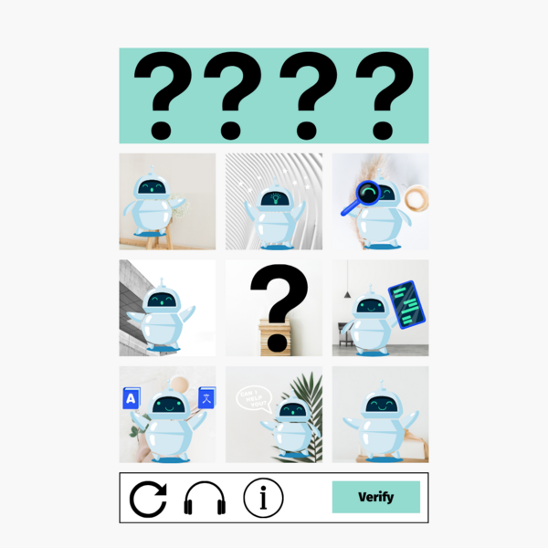
CAPTCHA is an essential need on online forms, but to be blunt, the UX sucks. Without the implementation tips (helpfully detailed below), Google’s otherwise reliable reCAPTCHA service implemented “as-is” doesn’t actually provide any browser validation. The user will have to wait for it to make a time-consuming round trip to the server. It’s a problem for anyone and becomes compounded for users with accessibility needs.

Mugo partner since 2024
Delaware County Libraries is a regional library system in Pennsylvania, USA.
Mugo partner since 2024
Dymax is a developer and manufacturer of broad-spectrum light-curable adhesives.
Mugo partner since 2024
Hibu provides digital marketing solutions to local businesses across the US.
Links are among a website's most valuable components. They connect (that’s what the word “link” means, after all) different pages and resources, helping site visitors find the content they are looking for. Well-planned and formatted links are like a detailed, intuitive treasure map that sends visitors to the right destination.
Links are also critical for making your website accessible to visitors with visual or other impairments. A link that lacks important information can prevent some visitors from accessing all the treasures a website holds. Or even worse, it can send users to completely undesirable content and discourage them from exploring all your site has to offer.
In this post, I’ll discuss how to present links in various contexts, clearly explaining how they can create and inform powerful relationships between different pages and assets.